


Improve your animal drawings by Fixing these Five Common Mistakes

Whether you prefer long or short fur, scales or feathers, animals are a wonderful subject to draw in any style. If you are struggling to make your animal drawings come to life on the page in a realistic way, then maybe these five remedies to common mistakes can help.

Mistake 1 - Fur Direction and Length
If your fur texture looks flat or bares no relation to the body beneath, odds are the strokes aren’t going in the right direction. Fix this and you’ll instantly see an improvement in the realism.
Real fur doesn’t grow randomly or in regimented rows. Improve your animal drawings immediately by ensuring it flows correctly over the body, often radiating from the eyes or nose and sweeping up over the head. Drawing fur with the correct fur-length, as well as including those subtle changes in direction, helps us describe the ‘form’ of the animal more accurately. By drawing fur that’s going in the wrong direction, or many directions, you lose that natural flow and your drawing can look flat and cartoony.

Fix
· Before you start drawing, study the reference and ensure you can see and understand the fur directions and fur lengths at each location.
· Try mapping in a few direction lines to help guide you, especially around tricky areas like the nose.
· Retain a tiny amount of organic direction in there. If it’s all lined up and exactly the same angle it can look just as strange.
Mistake 2 – Drawing every hair
The second mistake is trying to draw every single hair you see in the reference photo. I understand that, for realism, it feels logical: more detail = more realism. But in practice, it can mean the opposite.
Our brains are very clever at filtering out unnecessary data. Our eyes don’t perceive every hair unless we are actively looking at every hair. What we actually see is groups of hairs forming soft clumps, shapes, and value patterns. These fur shapes, especially with longer or curly fur, are what create the illusion of realism, and they’re much more enjoyable to draw.
If you focus on individual hairs too early, the drawing loses these larger patterns. The result looks busy, spaghetti-like and overworked, rather than natural and soft.

Fix:
Squint at the reference to reduce the detail you can see to find value shapes.
Don’t outline the clumps of fur or it will look fake. Focus on shadow and light and try drawing what’s right up next to the clump, rather than the clump itself.
Add selective detail only in focal areas, like the face, and finish with just a few flyaways.

Mistake 3: Using too few Colours
Choosing a single fur colour and building the whole drawing around that sounds right, but it is important to remember that even a black dog isn’t only black. Animal fur is never just one colour.
It takes practice but being able to see where a colour shifts from a greeny-yellow to a yellowy-green, for example, is important. These variations come from light and shadows, reflected colours and the natural pigmentation of the fur itself. Without them, the drawing can look flat, artificial and lifeless.
Fix:
· Study your reference and look for cool greys, warm oranges, muted golds and reddish browns.
· Use complimentary colours in the shadows rather than brown or black for better cohesiveness.
· Swatch your pencils, or create a blend, against the edge of a spare piece of paper so that you can place it right next to the colour you’re trying to match.
Mistake 4: Flat Eyes
In most animal portraits the eye is the first place viewers look. Humans are naturally drawn to eyes because they are great at communicating emotion, intelligence and life. If the eyes in a drawing look realistic, the whole portrait can feel alive. If they are flat or dull, even beautifully rendered fur isn’t believable.
Drawing the eye as a flat circle without attempting to create roundness or sit it within the skull is a common mistake. Using only black for the pupil and ignoring reflections will quickly make the eye seems dull and lifeless, or only using one colour for the iris when there should be many.

Fix:
· Study the reference to understand where the reflections create new colour shapes. They may be subtle, but they will probably be there. Draw them in before you start.
· Protect your highlights, especially on the pupil. You want them to shine brightly to draw the viewer in, so make sure you are always mindful of where they are.
· Colour the iris in a ‘radial’ motion that encircles the pupil, and layer different colours together to create little lines and dark spots for more realism.
· Look for shadows from overhanging fur and add those too.
Mistake 5: Whiskers
These thin curving lines are devilishly difficult to do, especially since you can’t draw white over dark with colour pencils on regular paper, so you need to factor them in early. For realism, they need be thin and tapered at the end, they need to be different lengths and cross over each other occasionally, and they must never be arrow straight at 90degrees from the cheek.
Here’s a few fixes that might make the process a little easier.
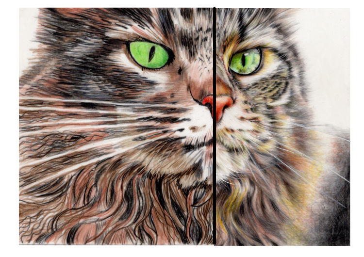
Fix:
· Choose Pastelmat for animal portraits. The textured surface will enable you to add whiskers with a sharp white pencil at the end.
· Intenting the whiskers before you add the fur. This is best done on a thicker paper. You can add white pencil firmly into the indentations to further protect them. You do still need to be careful though.
· Try scratching out the thinnest of whiskers with a scalpel or ceramic blade. You must do this in one fluid motion. It takes practice.
· White whiskers aren’t all white. They are often darker where they emerge from the fur, and shadows still affect them.
If you enjoyed this, but perhaps would like to follow some guidance with a tutorial, please take a look at these;
.

Good informative blog. Thanks for the time and effort!