Make your colours *POP* on black paper
- Helen Carter
- Aug 29, 2024
- 4 min read
Updated: Sep 2, 2025
“How can I make my drawings on black paper more like I see them online?”
This is a question I get asked every time I do a black paper drawing. Using colour pencils on black paper can make for a brilliantly vibrant artwork, but you need to have a few tricks up your sleeve and a little technique under your belt to get the best out of this combination. There are likely a few reasons why your drawing is not popping off the page. Let’s start with a trick and move on to the tips.
When you are online and see a drawing with bright colours and deep deep blacks, it has almost certainly been edited. A simple adjustment of the contrast is enough to make the black blacker and the brights brighter. If, like me, you regularly take photos of your art with your mobile phone, have a look at your photo editor (often a little icon of a pencil) and try adjusting the contrast, brightness and shadow settings.
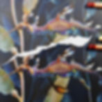
Look at the difference a little shift in the contrast and brightness and saturation can do!

The Paper itself also plays a role in how your photos come out. Shiny black paper, such as black sketchbook paper or cardstock, reflects a lot of light and is difficult to photograph. You can angle the paper to minimise the glare, but you risk the photograph becoming too dark or skewed. My preferred paper is Fabriano BlackBlack, which has one of the deepest black pages, doesn’t reflect much and has a great texture for colour pencils. It doesn’t take wet mediums well, so if you prefer a mixed media approach, I highly recommend the Derwent Black Mixed Media pads, they’re almost as black as the Fabriano and super for drawing on. Don't be fooled by theirs or other black paper sketchbooks though, those are really shiny pages!
Of course, the pencils you use can make a big difference too. While all colour pencils will work on black paper to some extent, some will work better than others. Of the more popular pencils, Faber Castell Polychromos are probably the most translucent and therefore least effective at covering the black. The softer Caran D’Ache Luminance are great and Lightfast are about the same, but both come with a hefty price tag. The Derwent Drawing range are very rich and cover the black extremely well, but they're super soft and you'll never get any fine details. Pablos, and Prismacolours are somewhere in the middle. A more budget-friendly and excellent choice is the Derwent Chromaflow, which perform brilliantly on black, and as you know are one of my favourite all-rounder pencils.
This colourful bubble was drawn on the Derwent Mixed Media pad with Chromaflow. That arc of light blue you see through the middle was done with a heavier layer of white below the turquoise and blue layers on top.

Now let’s talk techniques. One of the most common ways to brighten your colours is to begin with a light layer of white. You need to think backwards, draw only the highlights and lighter sections instead of shading into the shadows, but it is tremendously helpful. Beware using red with this method though. White under red turns it pink, so if you need a bright red, choose light orange or yellow beneath instead.

You don’t have to use white for the first layer. There's no hard and fast rules on that. An alternative is to use the lightest version of the colour you want, or pick a different colour completely to create a colour-shift on top. For example, a blue under the red will cool it down and maybe even turn it a bit purply.
When too much of the black paper shows through your top layer you’ll see it as little black flecks. These will break up the colour and dull it, so if you want to maximise the POP, you gotta get a sharp point and cover those little flecks. But you can also use the flecks to your advantage, especially in the shadows, where a transition from light to dark can be achieved by laying and moving to darker colours and allowing more of the paper to show.
Finally, I would say that it is important to swatch your pencils on your black paper before you start, so you can see the difference in the vibrancy of colours ahead of time. I often look at my pencils and pick a colour thinking I know what it will look like, only for it to look very different on black. You might find that your colour choices are too dark because you're swatching or testing or remembering what they look like on white.
TIP - Erasers can mark the surface of black paper. Try using a black colour pencil instead to colour over any happy little accidents!
Do you have a colour pencil question for me? Why not join my new Facebook group 'COLOUR PENCIL CLINIC' and join in the conversations and get some helpful answers from industry professionals.
